
BridgeTek brand center
Brand at a glance
BridgeTek, drawn like an engineering sheet
BridgeTek's brand is a navy ground, blue and amber accents, three typefaces, and two kinds of art: technical drawings of the BridgeTek Method, and ink and wash drawings of the real BridgeTek team. This page is the reference for anyone making something with the BridgeTek name on it, partners included, with the files to start from.
- Name
- BridgeTek, one word, capital T
- Drawings
- Technical sheets of the Method, with one amber diamond
- Human element
- Ink and wash drawings of the real BridgeTek team
- Typefaces
- Albert Sans, Inter, IBM Plex Mono
- Core colors
- NavyBlueAmberWhite
Logo
The b-tile, the name and the tagline
The logo is the b-tile beside the BridgeTek wordmark: the brand mark, as on staging. BridgeTek is one word with a capital T; the company's legal name is BridgeTek, Inc., used in contracts, statements of work and the copyright line ("© 2026 BridgeTek, Inc."). The color logo is for white and light grounds, the reverse logo for navy, and the mark stands alone where the full logo will not fit. Scout, BridgeTek's product, has its own mark: the amber diamond in a lens (see the diamond).
The tagline is Find it. Prove it. Ship it. It is the BridgeTek Method in three verbs, and it signs things off.
Logo, color
Navy b-tile and wordmark, for white and light grounds.
Logo, reverse
White b-tile and wordmark, for navy and dark grounds.
Mark, navy
The b-tile alone: favicons, app icons, social avatars.
Mark, white
The b-tile alone, for navy grounds.
Scout product mark
Scout's own mark: the amber diamond in a lens. For Scout only, never as the BridgeTek logo.








Do
Use the color logo on white and light grounds and the reverse logo on navy.
Keep half the b-tile's height clear on every side.
Use the mark alone where the space is square or small, such as favicons, app icons and avatars.
Start from the SVG files and scale the logo as one piece.
Keep the logo at least 20 px tall on screen and 0.25 in in print (open to review).
Don't
Recolor or outline the logo, or add shadows, glows or gradients.
Stretch, rotate or rearrange the b-tile and the wordmark.
Retype the wordmark in a font; use the files.
Place the logo on busy art, on photographs or on amber.
Draw the tagline or another name into the logo files. The tagline may sit beside or under the logo, outside its clear space.
The tagline
Written exactly so, "Find it. Prove it. Ship it." Three sentences, each with its period.
Set in Albert Sans Bold, at half the logo's height (cap to baseline about a third of the b-tile), in navy on light grounds and white on navy. Never in amber.
Sign off with it, beside or under the logo outside its clear space, on a business card back, a deck's closing slide, a PDF's back page and the foot of a social post.
Never as a page's H1, and never in the same view as the hero line "Veteran data science for enterprise AI."
Color
Navy first, amber for the diamond
Navy carries the brand. White and blue do the reading, linking and labeling. Amber is the diamond: a marker, a bullet, a node, the go / no-go. On the site's drawings it also hatches the Prove bay. In documents, decks and posts, amber rules, edges and rings are left out for now (open to review). Every value here is read from the site's own color tokens, so this page always matches the site.
Navy
#0E2A5C
RGB 14 42 92The brand color: the logo tile, headings on white, and the ground of dark pages.
Blue
#076AEA
RGB 7 106 234Links and buttons on white; the Discover phase and center lines in drawings.
Sky
#8AB8FF
RGB 138 184 255Links on navy; the Discover phase in dark drawings; the ink-and-wash blue.
Amber
#FFC53D
RGB 255 197 61The go / no-go mark, the Prove phase and rules under headings. One highlight at a time.
Amber text
#8F5B00
RGB 143 91 0Amber words on white or mist (amber itself is too light to read on white).
Teal
#0F766E
RGB 15 118 110Production and the Deliver phase on light grounds.
Teal on navy
#5CC8B8
RGB 92 200 184The Deliver phase on navy.
White
#FFFFFF
RGB 255 255 255The light page ground, and type on navy.
Ink
#0F1728
RGB 15 23 40Body text on light grounds.
Slate
#55627A
RGB 85 98 122Captions and secondary text on light grounds.
Mist
#F3F7FD
RGB 243 247 253Cards and panels on white.
Rule
#D3E1F5
RGB 211 225 245Fine rules, table lines and the drawing grid on white.
Navy lift
#16336B
RGB 22 51 107Cards and panels on navy.
Night
#081733
RGB 8 23 51The deepest band on dark pages.
Haze
#A9B4C7
RGB 169 180 199Captions and secondary text on navy.
Proportion
- Navy: most of the area
- White: type and light grounds
- Blue: links and lines
- Amber: one highlight
Contrast pairs that pass WCAG AA
| Sample | Text | Ground | Ratio | WCAG |
|---|---|---|---|---|
| Ink | White | 17.90:1 | AAA | |
| Navy | White | 13.96:1 | AAA | |
| Blue | White | 4.93:1 | AA | |
| Slate | White | 6.15:1 | AA | |
| Amber text | White | 5.73:1 | AA | |
| Teal | White | 5.47:1 | AA | |
| Navy | Mist | 12.98:1 | AAA | |
| Navy | Amber | 8.84:1 | AAA | |
| White | Navy | 13.96:1 | AAA | |
| Sky | Navy | 6.90:1 | AA | |
| Amber | Navy | 8.84:1 | AAA | |
| Teal on navy | Navy | 6.92:1 | AA | |
| Haze | Navy | 6.67:1 | AA | |
| White | Navy lift | 12.21:1 | AAA | |
| White | Night | 17.79:1 | AAA |
The BridgeTek Method phases
Discover
Find the use case worth doing.
On light #076AEAOn navy #8AB8FFProve
Prototype on your data; go / no-go.
On light #FFC53DOn navy #FFC53DDeliver
Build it and run it.
On light #0F766EOn navy #5CC8B8
Do
Let navy cover most of the area, with white type.
Use amber as the solid diamond, as a bullet, a marker or a node.
Pick text and ground from the contrast pairs above. Each passes WCAG AA for body text.
Color the BridgeTek Method the same way everywhere. Discover is blue and Deliver is teal; Prove is navy with the diamond at its go / no-go.
Don't
Add colors or tints outside this palette without Mark's approval.
Set amber words on white. Use Amber text for words; amber itself is for the diamond.
Draw amber rules, edges, rings or washes in documents, decks or posts (open to review).
Underline a heading or rule off a section in amber or gold. Headings stand on their own, under a blue mono label.
Use a phase color for anything but its phase.
Typography
Albert Sans, Inter and IBM Plex Mono
Albert Sans sets the headings, Inter the reading text and IBM Plex Mono the labels. All three are free under the SIL Open Font License: Albert Sans, Inter and IBM Plex Mono. The scale steps by a perfect fourth from a 17 px body on desktop and tightens on phones.
Albert Sans
Headings and the wordmark's feel. Bold (700) for H1 and H2, semibold (600) for H3.
Inter
Body, intros, buttons and tables. Regular (400), semibold (600) for emphasis.
IBM Plex Mono
Labels, eyebrows and drawing annotations, in capitals with open tracking.
| Step | Sample | Size | Weight / line | Use |
|---|---|---|---|---|
| Display | Find the use case | 42–56px | 700 / 1.08 | The home page hero. |
| H1 | Find the use case | 34–48px | 700 / 1.1 | One page title. |
| H2 | Find the use case | 28–30.2px | 700 / 1.15 | Section headings. |
| H3 | Find the use case | 21–22.8px | 600 / 1.25 | Card and sub-section headings. |
| Lead | Find the use case | 18.5–20px | 400 / 1.5 | Intros under a heading. |
| Body | Find the use case | 17px | 400 / 1.6 | Running text. |
| Small | Find the use case | 15px | 400 / 1.5 | Captions, buttons, notes. |
| Label | ONE TEAM, START TO FINISH | 14px | 600 / 1.3 | Eyebrows and drawing labels, in capitals. |
Do
Write headings in sentence case, with one H1 on a page.
Set labels and eyebrows in IBM Plex Mono capitals with open letter spacing.
Where the fonts can't be installed, use the system sans the site falls back to (Segoe UI, Helvetica or Arial).
Don't
Set long passages in Albert Sans or in mono.
Mix in other typefaces.
Icons
One line set, drawn like the diagrams
Every icon on the site, on a 24 px grid with a single 1.5 stroke, square ends, sharp corners and small solid nodes where the drawing has them. Each name is the meaning the site uses it for. Download one as SVG, or all of them in one file.
All 20 icons in one file:


Do
Draw an icon in one color, the text color or its phase color.
Scale the whole icon and keep its stroke weight in proportion.
Use an icon for the meaning in its name.
Don't
Fill the shapes, add a second color or mix in icons from other sets.
Put words or numbers inside an icon.
Illustration and people
Ink and wash, the signature human element
Real BridgeTek people, drawn in ink line with blue watercolor washes and a few short amber strokes. Each person sits on a soft blue wash that fades into the page. A group tableau sits on a gold wash. A BridgeTek Labs article gets one scene of its author at work.
Richard Sexton
Casey DeCarlo
Anthony Racca
Josh Krasnegor
Tory Skyers
Shaun Applegate-Swanson
Mark Cicoria
Jason Larkin
Who may appear
Only Richard Sexton, Casey DeCarlo, Anthony Racca, Josh Krasnegor, Tory Skyers, Shaun Applegate-Swanson, Mark Cicoria and Jason Larkin, and each only once the people kit clears them for the site.
Never Amy Lee or Jonathan Dinu.
Clients, audiences and anyone else are left out of the art. They are never invented.
How people are drawn
Mark is always drawn with a closed mouth.
Faces are fully visible, with closed-mouth smiles.
Amber goes only in short strokes on a collar or a shoulder, never in hair or on a face.
Individuals get the blue wash; the gold wash is kept for group tableaux.
Vary pose, facing and framing from one scene to the next.
Make every image whole. Never crop a face, edit it and paste it back.
Never in the art
Words, letters, numbers, logos, product names or customer names.
Diagrams other than lines, shapes and arrows.
Drawings and diagrams
Technical drawings, the other half of the brand
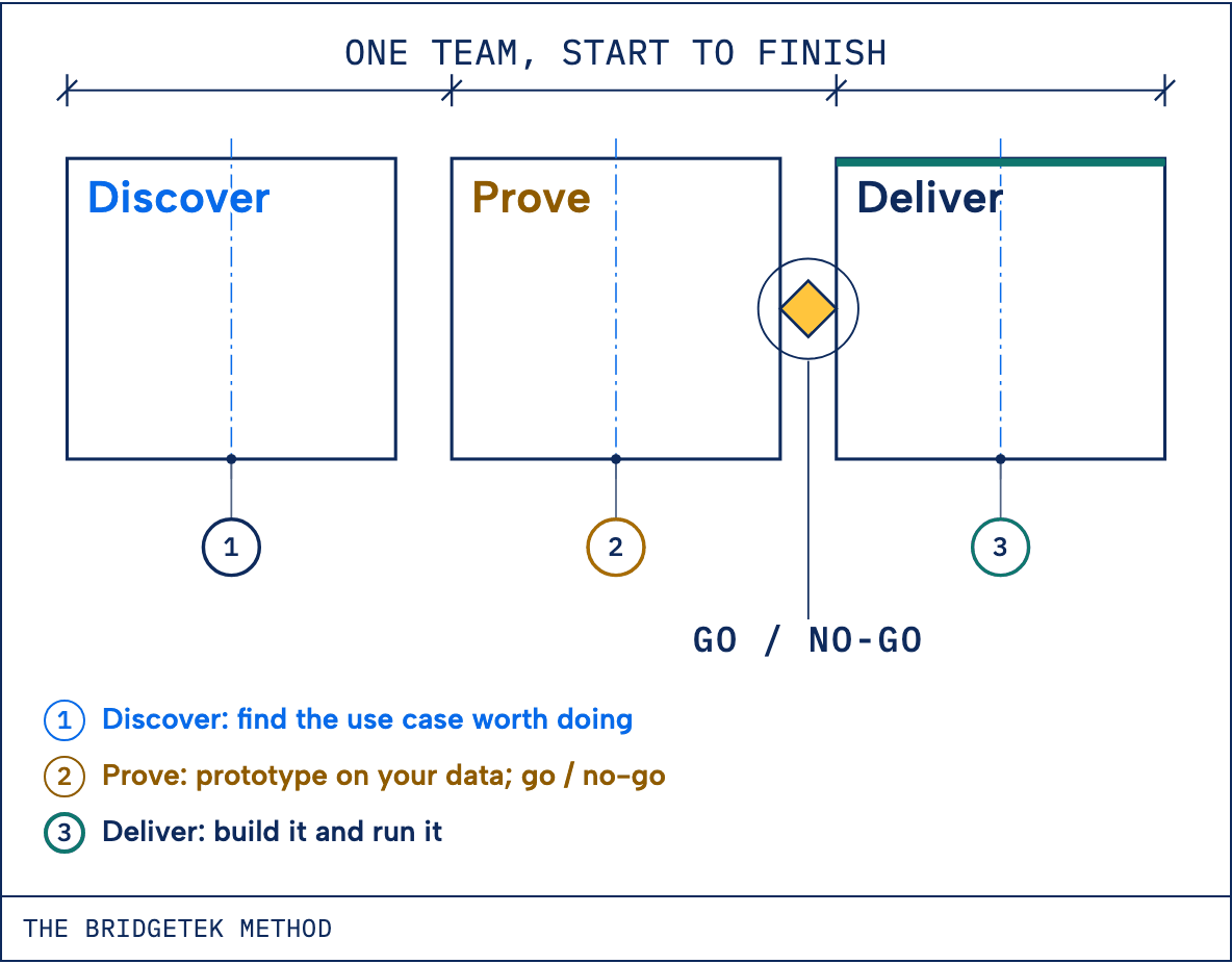
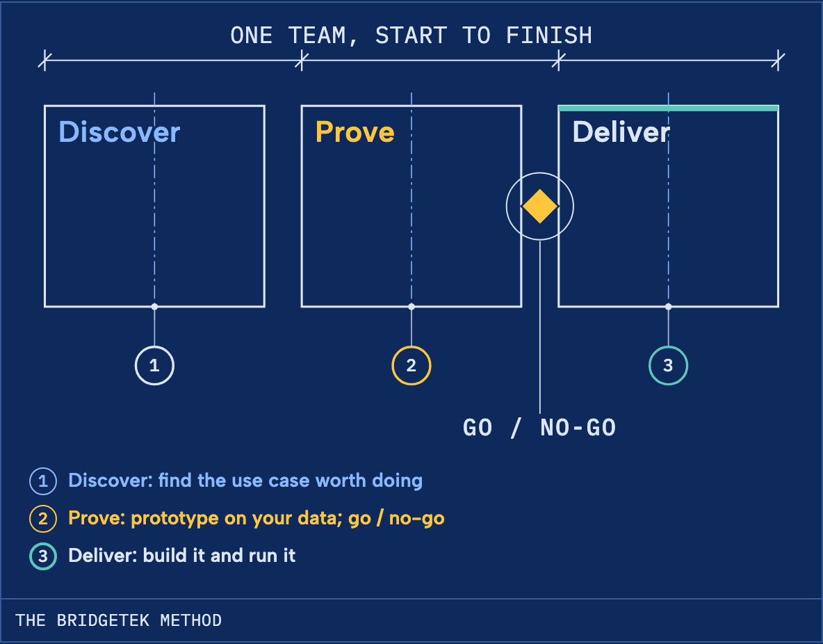
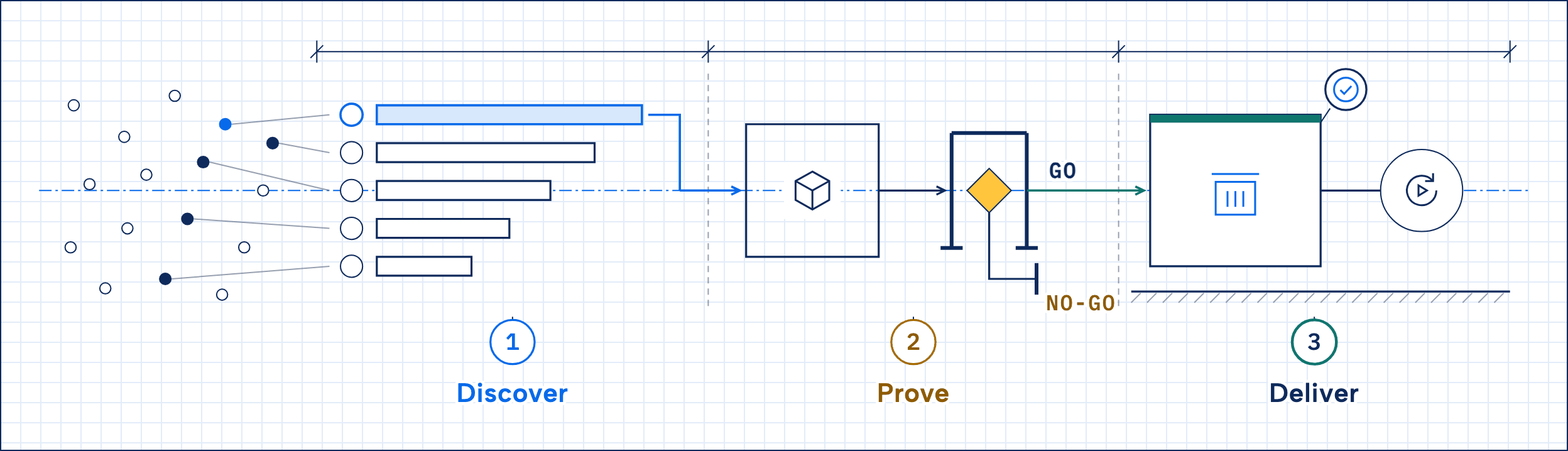
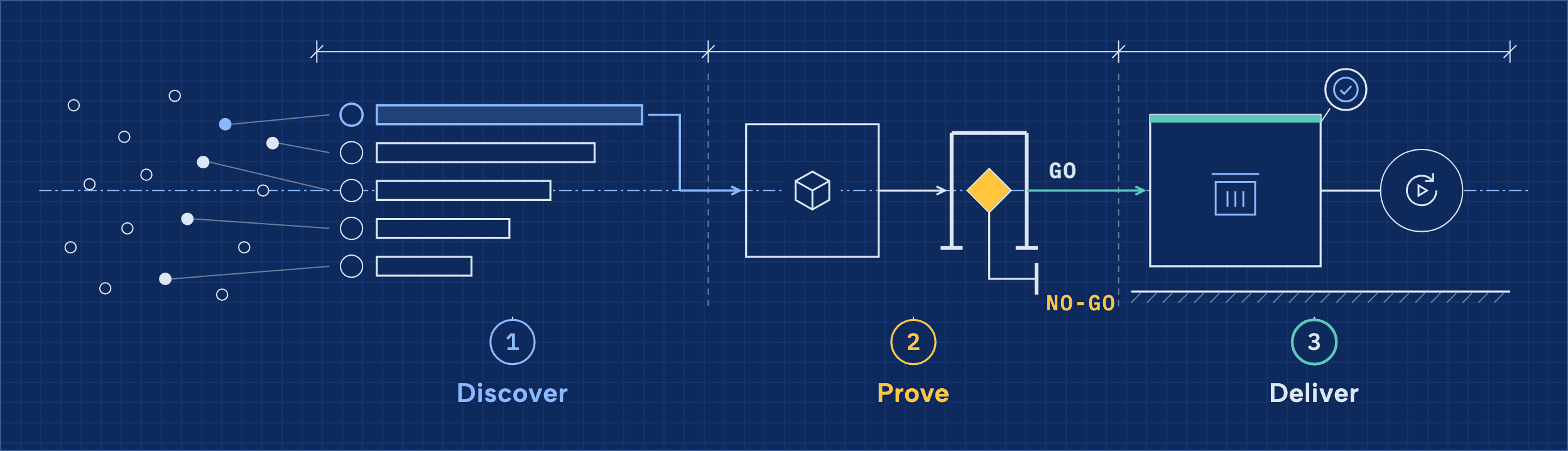
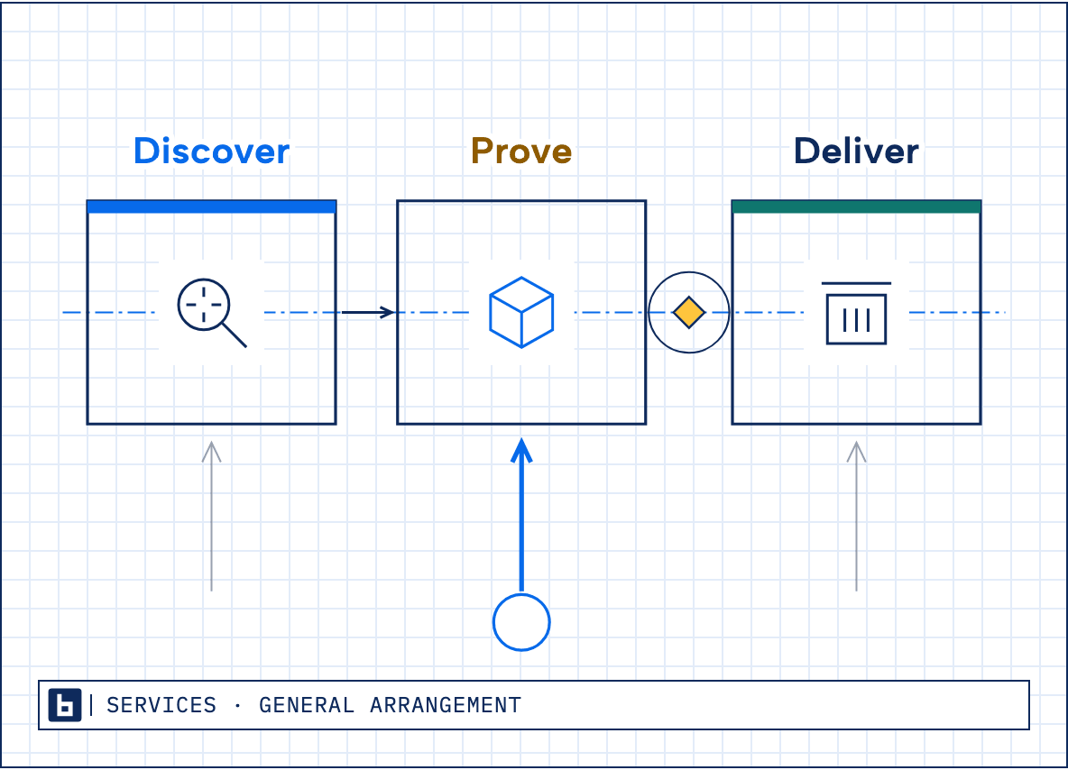
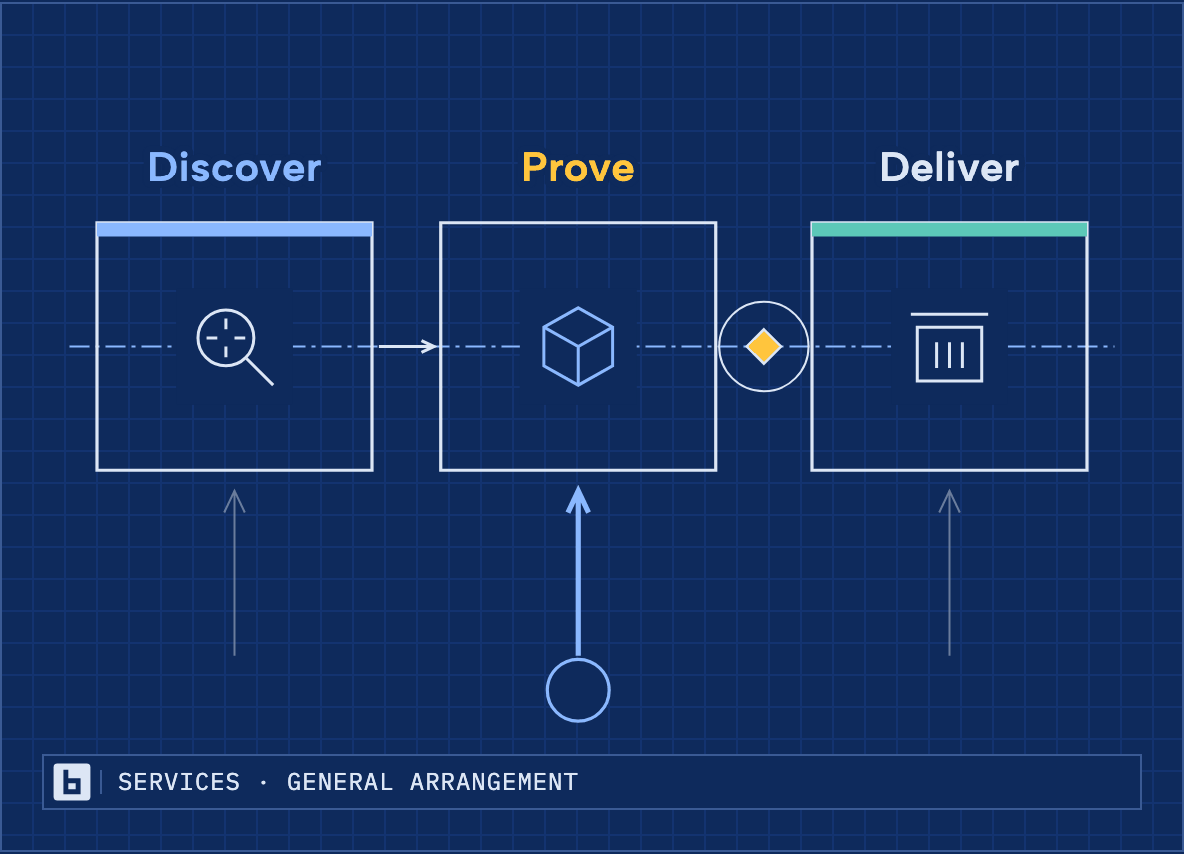
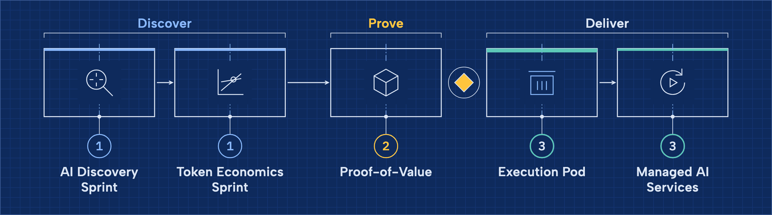
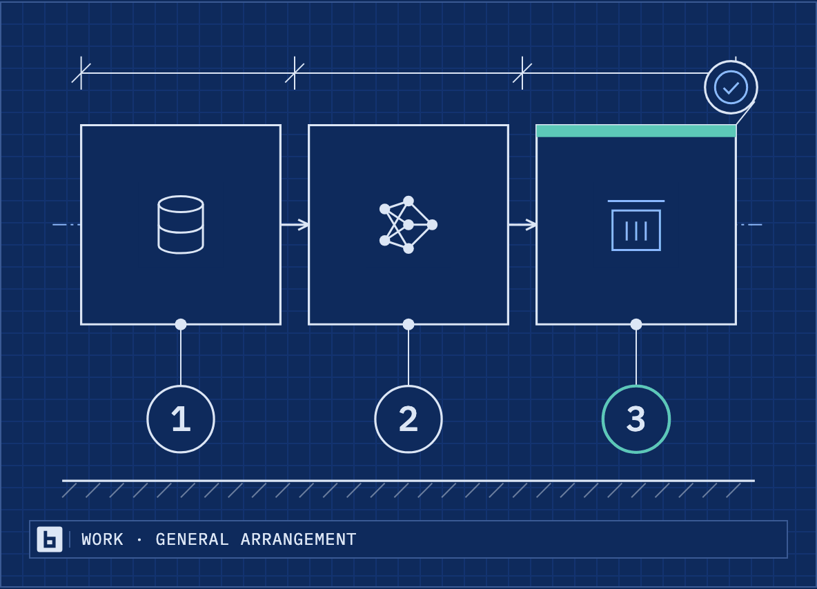
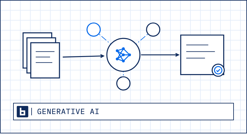
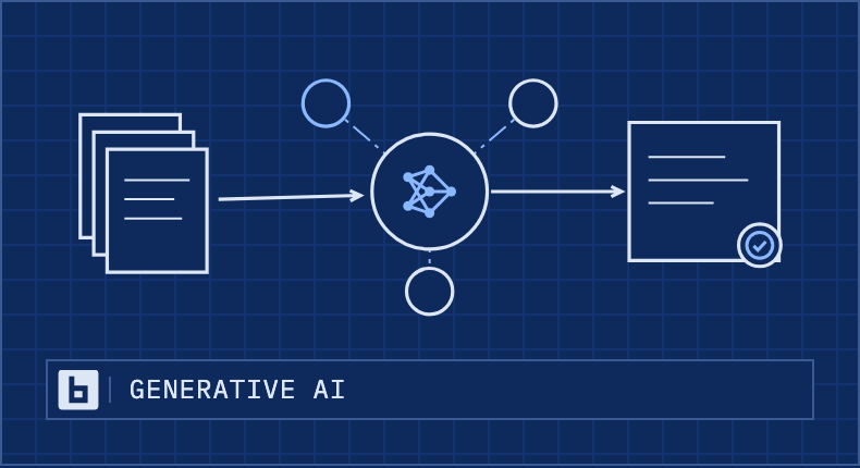
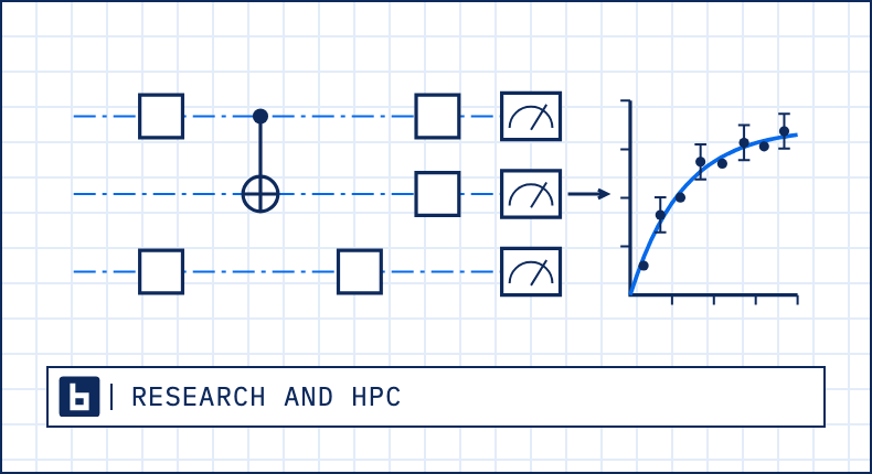
The site's drawings read like an engineering sheet: fine navy line on a faint grid, blue center lines, mono labels, numbered balloons, a title block, amber hatching and the go / no-go diamond for Prove, and teal for production. Discover, Prove and Deliver are always three bays, in that order. On navy the same drawing reverses, light line on a navy sheet. Every drawing below is the site's own, captured from the page it sits on, on white and on navy.
Drawings are the option for anything without people: a social post, a deck, a report cover, a section opener. The deck with drawings and the drawing posts under Social show them in use.
The BridgeTek Method
On the site: Home page hero. PNG at 2x, for documents: the Prove hatch is left out.
The Method, in one line
On the site: Home page, the Method band. PNG at 2x, for documents: the Prove hatch is left out.
Three bays
On the site: Services page hero. PNG at 2x, for documents: the Prove hatch is left out.
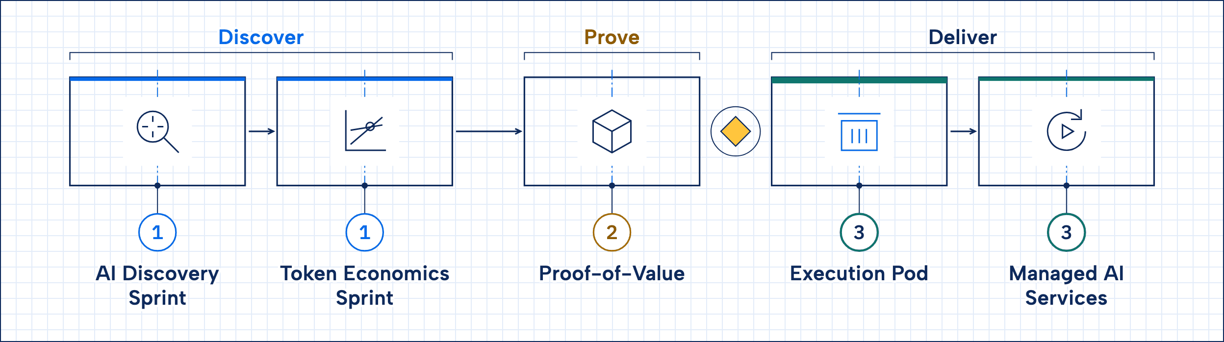
The services by phase
On the site: Services page, the Method. PNG at 2x, for documents: the Prove hatch is left out.
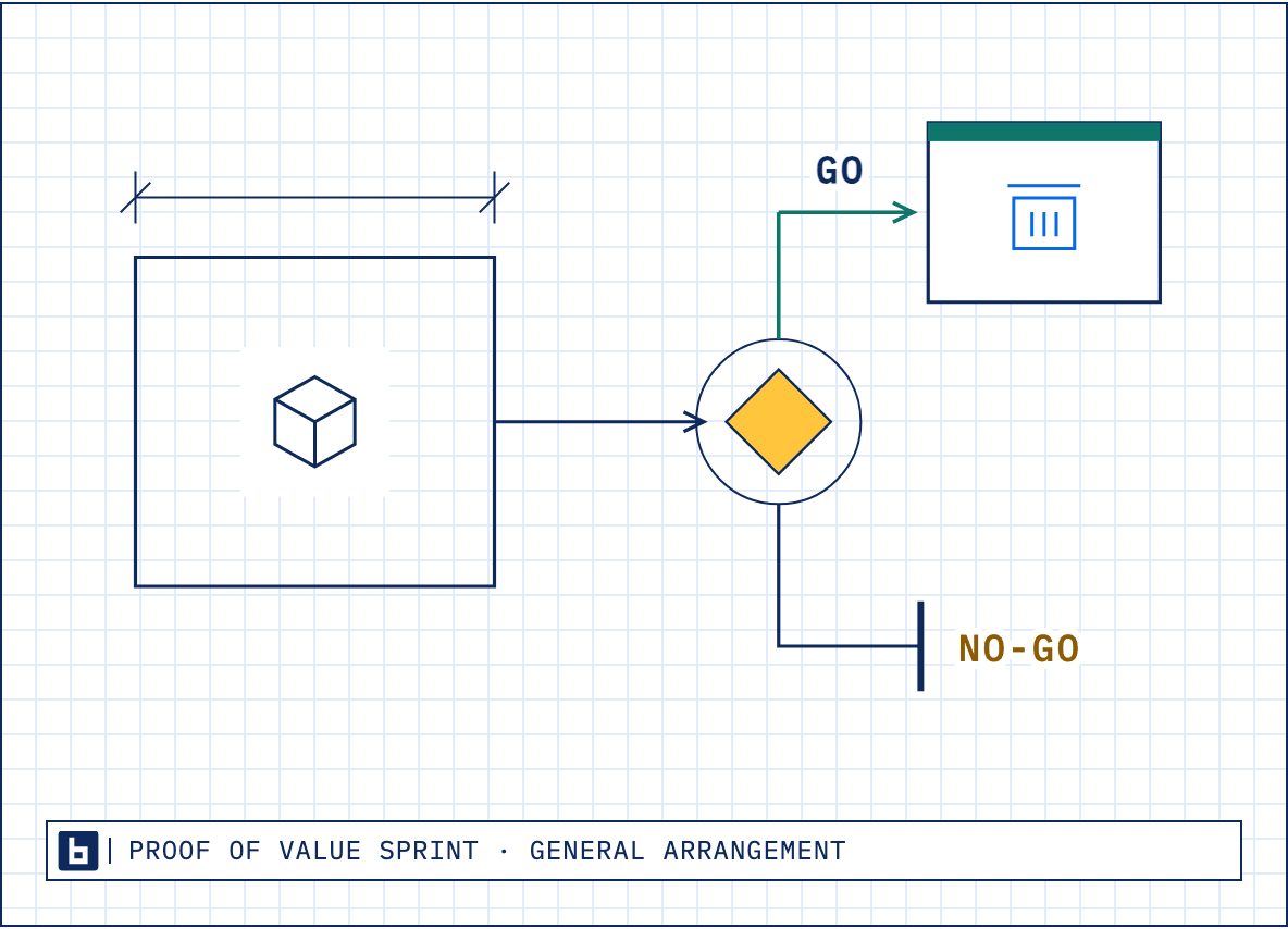
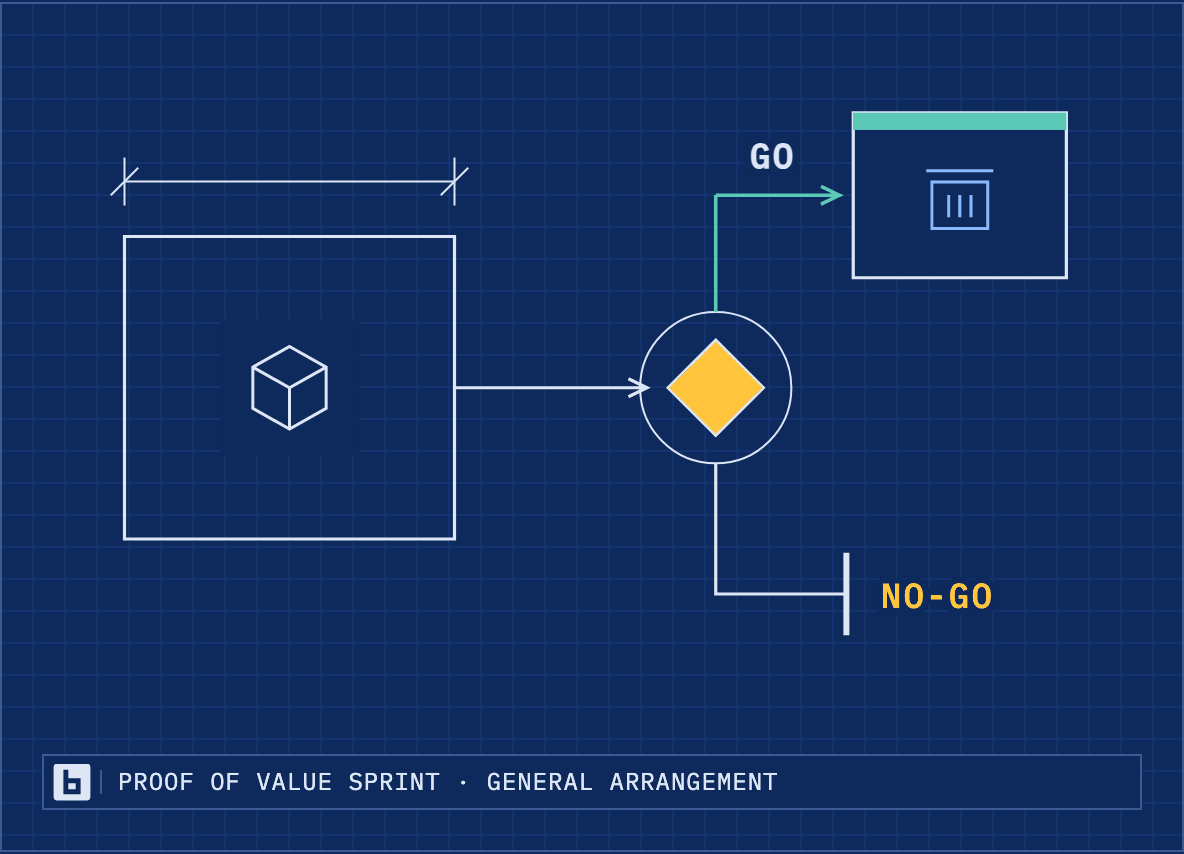
Go / no-go
On the site: Proof-of-Value page. PNG at 2x, for documents: the Prove hatch is left out.
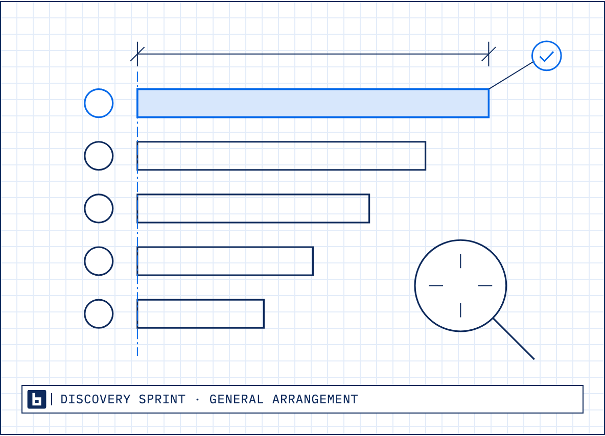
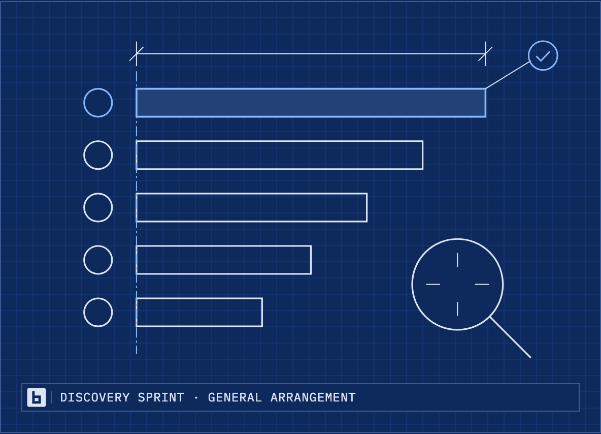
Ranked use cases
On the site: AI Discovery Sprint page. PNG at 2x, for documents: the Prove hatch is left out.
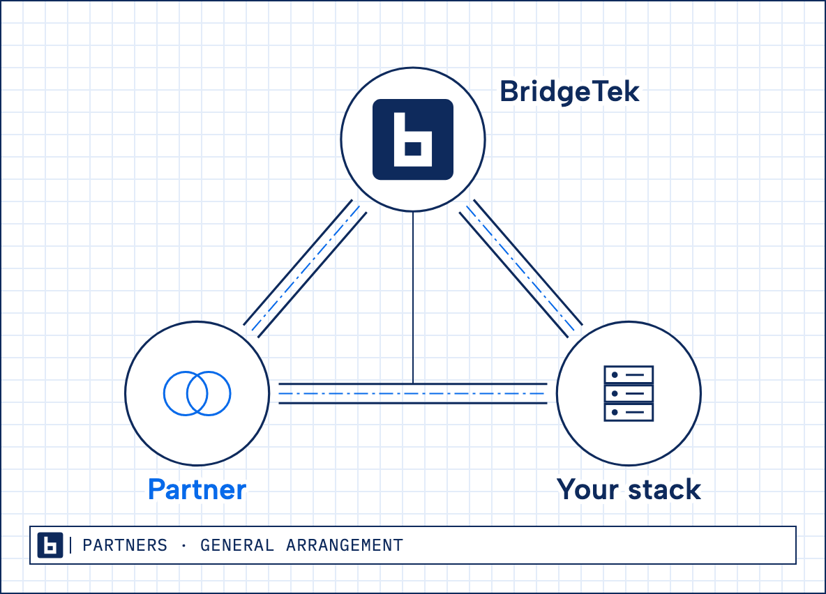
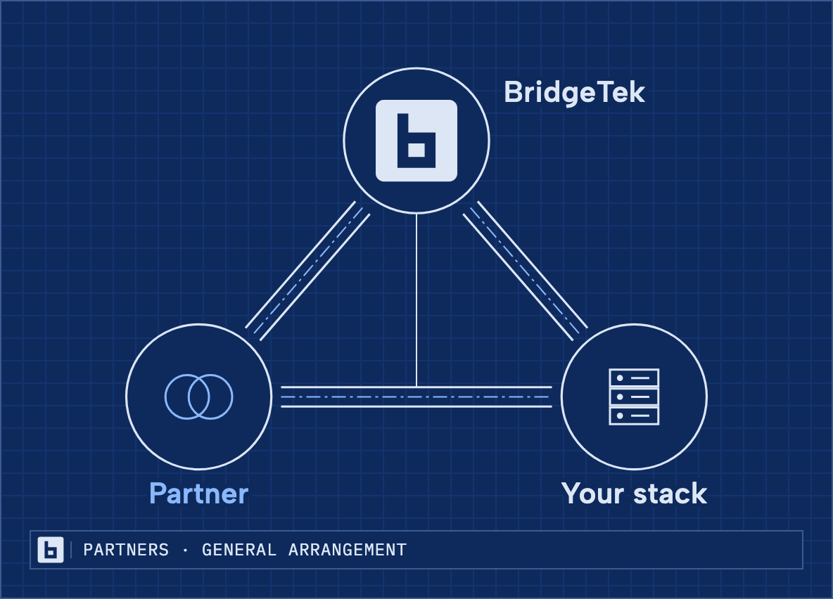
Partner, BridgeTek, your stack
On the site: Partners page. PNG at 2x, for documents: the Prove hatch is left out.
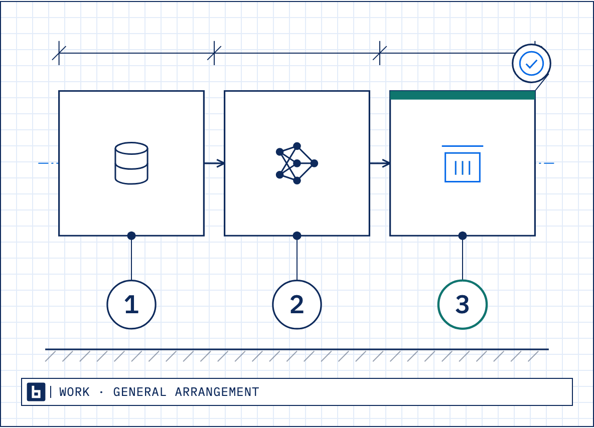
Data to production
On the site: Work page. PNG at 2x, for documents: the Prove hatch is left out.
Generative AI
On the site: Work page. PNG at 2x, for documents: the Prove hatch is left out.
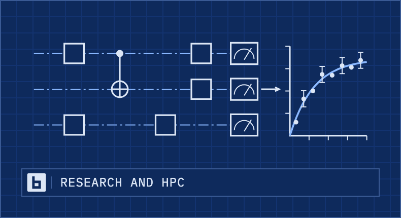
Research and HPC
On the site: Work page. PNG at 2x, for documents: the Prove hatch is left out.
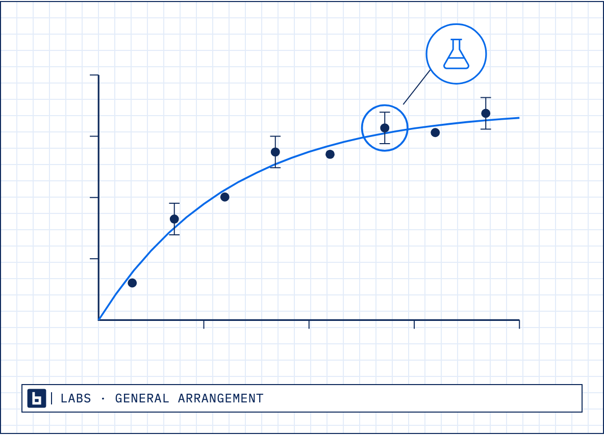
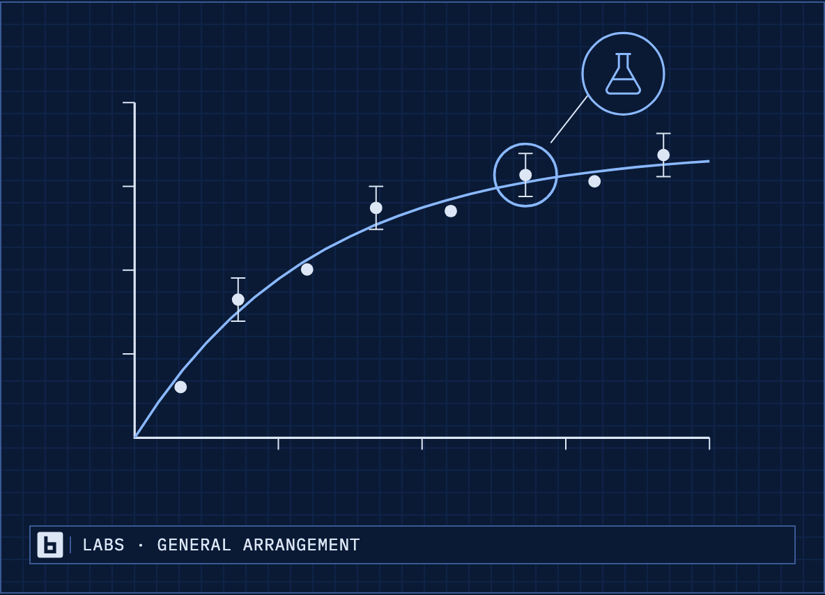
Measured
On the site: BridgeTek Labs. PNG at 2x, for documents: the Prove hatch is left out.
How a drawing is made
- Line
- Navy 1.6 for outlines, 1.0 for dimensions, 0.9 for leaders. Square ends, sharp corners.
- Center lines
- Blue 0.8, dash-dot 10 3 2 3, through the middle of each bay.
- Prove
- 45° hatch in amber, 6 units apart; the go / no-go diamond on the joint with Deliver.
- Deliver
- A 4-unit teal cap on the bay: production.
- Labels
- IBM Plex Mono capitals, numbered balloons (r 14), a legend, and a title block: “<NAME> · GENERAL ARRANGEMENT”.
- Sheet
- A faint 16-unit grid, a 1.5 frame. On navy the same drawing reverses: light line, sky-blue center lines.
Figures in BridgeTek Labs articles
Use them
Place a drawing whole, on its own sheet with its title block. Scale it; don't crop, recolor or set text over it.
Use the white version on white and light grounds and the navy version on navy.
Pick the drawing that makes the slide's or post's one point. The Method for how we work, go / no-go for a proof, partners for the partner story.
Reports and playbooks use drawings only. Proposals and decks may use drawings or people.
Make a new one
Site drawings are code: inline SVG in the web-next repo, src/brands/current-evolved/ (HeroVisual.tsx for the Method, art.tsx and art-parts.tsx for the rest; the diamond, balloons, dimensions and title block are parts there). Colors are the --color-draw-* tokens in tokens.css; stroke rules are in art.css and HeroVisual.css.
Ask an engineer to add it to the site; scripts/brand-center/build.ts --drawings then exports it here as a PNG, on white and on navy.
For a one-off in a document or a Labs article, draw it as SVG with the same rules: navy line 1.6, blue dash-dot center lines 0.8, IBM Plex Mono capitals for labels, the 45° amber hatch only on Prove, a title block, square corners.
Don't
Add shading, 3D, gradients, glows, clip art or stock icons.
Put more than one go / no-go diamond in a drawing.
Show a number unless it comes from the claims register with its source.
The amber diamond
One solid diamond
The amber diamond is BridgeTek's one amber mark: a square turned 45°, solid amber, with no outline and no ring, drawn exactly as in Scout's app icon, where it sits in a white magnifier lens on navy. It stands for the go / no-go in the BridgeTek Method: the decision at the end of Prove, before anything goes to production.
Use it as a marker, a bullet, a node on a drawing, or before a verdict. Scout's icon is the product mark; use the file below and don't redraw it.
Scout product mark
The diamond's source: Scout's icon, the diamond in a lens. Use this file for Scout; don't redraw it.
On navy
8 px · a bullet / 12 px · inline, before a label / 24 px · a node
On white
8 px · a bullet / 12 px · inline, before a label / 24 px · a node
- The diamond alone, solid amber:
Where it goes
Bullets and markers in documents, decks and posts.
A node or the decision point on a drawing.
A verdict or recommendation in a report (Pursue / Defer), before the word.
A go / no-go milestone in a timeline or plan.
On navy, white or the light surface, always solid. On white, where its contrast is low, let its size, its place and the word beside it carry the meaning; never add an outline to make it stand out.
Sizes
On screen 8 px as a bullet, 12 px inline before a label, 24 px as a node. Never under 8 px.
In print 2 mm as a bullet, 3 mm inline, 5 mm in a callout or verdict, 8 mm as a node.
The diamond spans the same share of its box as in Scout's icon (224 of 1,024 corner to corner).
Don't
Outline it, ring it, add a shadow or a gradient, or round its corners.
Recolor it, set it on amber, or stretch it.
Use it as a rating, a "featured" badge or a stand-in for the BridgeTek logo.
Templates
Decks and documents
Start every deck and document from these. There are two decks: one with the ink and wash team on the title and closing slides, and one with the site's drawings and no people. The PDFs open on a flat navy cover over the drawing grid, closed by a title-block strip; from page 2 they carry the logo and title at the top and a mono reference line and page count at the foot. Each section opens with a numbered blue mono label over its heading. Cards and callouts are the site's square cards with a navy top rule. Bracketed text is a placeholder; replace all of it. Install the three fonts first.
The Scout request form is an Excel workbook: the intake form a partner or seller fills in to request a Scout report. A statement of work is written in Word and sent as a PDF, from the generator in the scout repo's collateral tools; the PDF here is its layout. The other PDFs are built from HTML in the web-next repo (scripts/brand-center/); an engineer can make an editable copy.
Presentation, with people
16:9 PowerPoint: title, section, content, two columns, quote and closing. The title and closing slides carry the ink and wash team.
Presentation, with drawings
The same deck with no people: the site's technical drawings on the title, section, drawing and closing slides.
One-pager
One Letter page: cover, outcomes, the three phases and a next step.
Statement of work
Scope, deliverables, timeline by phase, team, assumptions, fees and sign-off.
AIO report
Cover with the index and verdict, summary, ranked use cases, the path from here, and sources and limits.
Scout request
Excel intake form for requesting Scout reports: one row per account, with the sales rep, website, industry, Scout and OEM.
Before it goes out
Every bracket is replaced, and every number has its source.
A client is named only in that client's own documents.
Fees appear only in a client's own statement of work.
American English throughout.
Layout grid
Twelve columns, everywhere
Everything is laid out on one grid, scaled to the medium. On the web it is the site's own: twelve columns in the 1,296 px content area, 24 px gutters. Print, slides and social posts use twelve columns too, business cards six. Every kit file above and below is set on these numbers; the drawing grid behind covers and posts is the same module.
Web
- Columns
- 12
- Column
- 82 px
- Gutter
- 24 px
- Margins
- 24 px sides
- Module
- 8 px
The 1296 px content container with 24 px padding (16 px and 4 columns on phones). Sections are 48, 80 or 120 px apart. Drawings sit on a 16 px grid.
Print, US Letter
- Columns
- 12
- Column
- 9.492 mm
- Gutter
- 4 mm
- Margins
- 29 mm sides, 21 top, 18 foot
- Module
- 2 mm
Pages 2 on. The cover is full bleed, its type on the same columns. The drawing grid behind covers is 4 mm.
Slides, 16:9
- Columns
- 12
- Column
- 0.749 in
- Gutter
- 0.25 in
- Margins
- 0.8 in sides, 0.6 top, 0.75 foot
- Module
- 0.05 in
The footer (logo, deck title, slide number) sits in the bottom margin.
Social, 1200 × 627
- Columns
- 12
- Column
- 68.667 px
- Gutter
- 24 px
- Margins
- 56 px sides, 56 top, 36 foot
- Module
- 24 px
Copy on columns 1–6, art on 7–12. The title-block strip runs margin to margin along the foot.
Social, 1080 × 1080
- Columns
- 12
- Column
- 56 px
- Gutter
- 24 px
- Margins
- 72 px sides, 72 top, 48 foot
- Module
- 24 px
Copy across all twelve columns at the top, art below it, the strip along the foot.
Business card, 3.5 × 2 in
- Columns
- 6
- Column
- 0.396 in
- Gutter
- 0.125 in
- Margins
- 0.25 in sides, 0.25 top, 0.2 foot
- Module
- 0.063 in
Measured from the trim; the 0.125 in bleed is outside it.
Use it
Start a text block, a card or a drawing on a column edge and end it on one.
Split a page or slide 6 + 6, 7 + 5 or 8 + 4; set three things on 4 columns each.
Space things in steps of the module (8 px on the web, 2 mm in print).
Keep the margins clear except for full-bleed grounds and art.
Collateral and reports
AI opportunity reports, sales playbooks and collateral
Scout produces BridgeTek's AI opportunity (AIO) reports and sales playbooks, and the collateral tools produce the service briefs, one-pagers and partner plays. Both follow the layout of the samples below, which show every part of a report filled in with illustrative values. The full spec, with each color, font, size and part mapped to the settings those tools read, is docs/brand/collateral-and-reports.md.
AI opportunity report, sample
Eight Letter pages for an illustrative company: cover with the index, contents, ranked use cases, a deep dive with a chart, readiness, the path, next steps, and the back page.
Sales playbook, sample
Internal: the navy strip on every page, the verdict on the cover, the account, who to talk to, the play by phase, battlecards, objections, partner fit and next steps.
Every document
Cover: flat navy on the drawing grid; the white logo and the document code; a sky-blue mono eyebrow naming the kind; the title in Albert Sans on columns 1 to 7; a site drawing on 8 to 12; a title-block strip along the foot. Back page: the logo, the tagline and "© 2026 BridgeTek, Inc."
Running header from page 2: the color logo and the title over a hairline. Footer: a hairline over a mono line with the code, kind, BridgeTek and the page count.
Each section: a numbered blue mono label, then the heading in navy. No rule under a heading, in any color.
Tables: mono header row on the light surface over a navy rule, hairlines between rows, no fills and no vertical rules.
Cards and callouts: the light surface, a hairline outline and a 3 pt navy top rule. Square corners everywhere.
Lists: the solid amber diamond as the bullet. Steps: numbered balloons, navy, teal for Deliver.
AIO reports
Page 1: the cover with the AI opportunity index (the score out of 100) and the verdict, Pursue or Defer, after the diamond. Then a stat band, each figure with its source, and the executive summary.
Then contents, the company, ranked use cases with score bars, a deep dive, readiness, the market, the path (the three Method bays), next steps, sources and limits, and a navy back page.
Scores use the brand's own ramp: teal 70 and over, blue 55 to 69, amber 40 to 54 (a data color, open to review), gray under 40. The number is always printed. Never red.
Charts sit on a drawing sheet: navy frame, faint grid, blue bars or lines, a title that states the message, and a source line.
Sales playbooks
Internal: a navy strip across the top of every page reads INTERNAL · NOT FOR CUSTOMER DISTRIBUTION.
The cover gives the account, the verdict with the diamond and the index, and a drawing. Then the account, who to talk to (one card per role), the play by phase, battlecards, objections and answers, partner fit, and next steps.
Where price comes up, the answer is: Pricing through your partners or on a call.
Business cards
Business cards
3.5 × 2 in, printed on both sides, with a 0.125 in bleed on every edge. The PDF page is 3.75 × 2.25 in with its trim and bleed boxes set, ready for a printer. The front is the white logo on navy over the drawing grid, with a title-block line. The back has the name, title, phone and email in navy on white, under the site's navy top rule, with the mark and the tagline. Both sides sit on the card's six-column grid. The sample's number is a fictional 555 number.
Voice
Plain, concrete, willing to disclaim
The full rules are in content/brand/voice.md, the source of truth, with the retired terms in content/brand/retired-terms.yaml. In short:
Always
Say what we do in the reader's terms, one idea per sentence.
Give every number its source and its limits. Numbers come from the claims register.
Write in American English.
State independence in these words: "We don't resell the hardware, cloud or licenses we recommend."
Where price comes up, write: "Pricing through your partners or on a call."
Never
Superlatives or hype.
Invented claims, customers, quotes, prices or benchmarks.
Contrast sentences that set a claim against what it is said to beat, unless Mark has approved them.
The retired terms, or the stock words listed in voice.md.
Social posts
Examples for LinkedIn and X
Built from the site's own art and published copy, in the two sizes the platforms show best: 1200 × 627 for link posts and 1080 × 1080 for the feed. Each sits on one of the site's own grounds (navy, the Labs deep navy, white or the light surface) under the faint drawing grid, so a run of posts doesn't repeat one background. Two show the team in ink and wash; four use the site's drawings, for posts that shouldn't show people.
The team: leadership
The home page headline with Casey, Richard and Anthony in ink and wash.
The team: mixed
The home page headline with Shaun, Richard, Tory and Casey in ink and wash.
The BridgeTek Method
The Method drawing on a white sheet, with the Discover, Prove, Deliver line.
Proof-of-Value
The service page's own drawing: a prototype, the go / no-go diamond, go or stop.
How we engage
Discover, Prove and Deliver as three bays, on the light surface.
BridgeTek Labs, no people
The Labs strapline beside the Labs drawing, on the Labs deep navy.
Do
Use copy already on the site or in a published BridgeTek Labs article.
Keep the logo top left and the title-block strip along the foot, with the page the post links to, the tagline and bridgetek.ai. A post that carries the hero line leaves the tagline off.
Set copy on columns 1 to 6 and art on 7 to 12 (1200 × 627), or copy across the top and art below (1080 × 1080).
Alternate grounds and art from one post to the next.
Write the alt text when you post.
Don't
Add numbers, quotes or customer names that are not in the claims register.
Add a colored edge, a gradient or a glow.
Show prices.